In my Digital Skills module last year, we had an assignment to edit two CD covers. One was from a reference photo of a 'band' taken by a previous year group, and another was an abstract one.
Cover 1: Band Photo
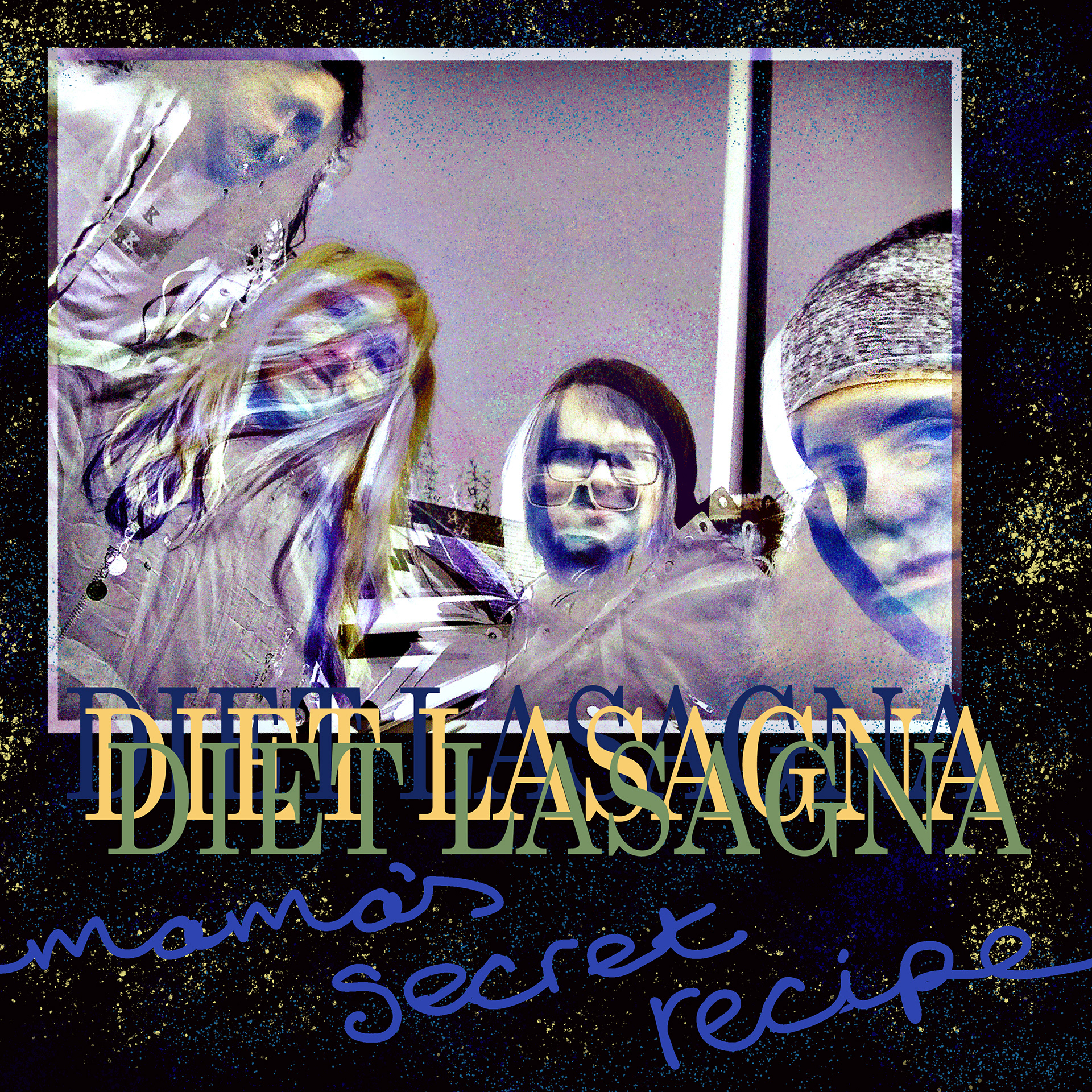
When I saw the photo, I was instantly aware that I would not be able to cut out the members and play with them and use the photo, which was something I was maybe hoping to do for this assignment. I started to think about what the band and album name would be and what genre they would be. My boyfriend is a musician and had the name ‘Diet Lasagna’ as a possible song or EP title on a long list of names. When he told me this name a while ago, I thought that it was so funny and when it came to choosing a name for this band, I felt that it was the perfect opportunity to use it. The name of the album ‘Mama’s Secret Recipe’ came to me as a natural progression, tying in with the lasagna theme. The title also gave the name a little bit of a creepy and sinister vibe, which also helped me to come to the decision of the band’s genre to be new-age metal.
I wasn’t very inspired by the photo itself, so I decided to play around with different effects and filters on Photoshop and see what I could create. After adding some noise, messing with the saturation and throwing several different effects and filters onto the original photograph I liked the final look of it. When I added it to the blank canvas for the album cover, it was significantly smaller. From this, I knew then that I would not be able to just make the image the whole cover. The photo was also more rectangular, so if I was to use it as the whole album cover it would have cut off a member or two.
For adding the name of the band, I cycled through the fonts on Photoshop until I found Century Schoolbook and I felt it worked the best, as I wanted something that was classic and simplistic, such as Times New Roman, however this font is much taller, and looks more gothic. I chose the three colours by selecting them from the edited band photo.
To write the name of the album, I decided to write it by hand, to give a different texture to the cover. I then made the background colour a very dark purple. I selected one of the darker colours in the edited photo, but then played with it a little bit to make it the perfect shade.
I felt then that the piece was nearly done, but still needed a little something to tie it all together. I explored all the different brushes I had and found a few different splatter effect ones that I felt could give a fun effect to the piece. Using different selected colours from the edited photo, and with the brushes on a variety of sizes and harshness, I scribbled them all over their own layer, just above the background but underneath all the other elements.
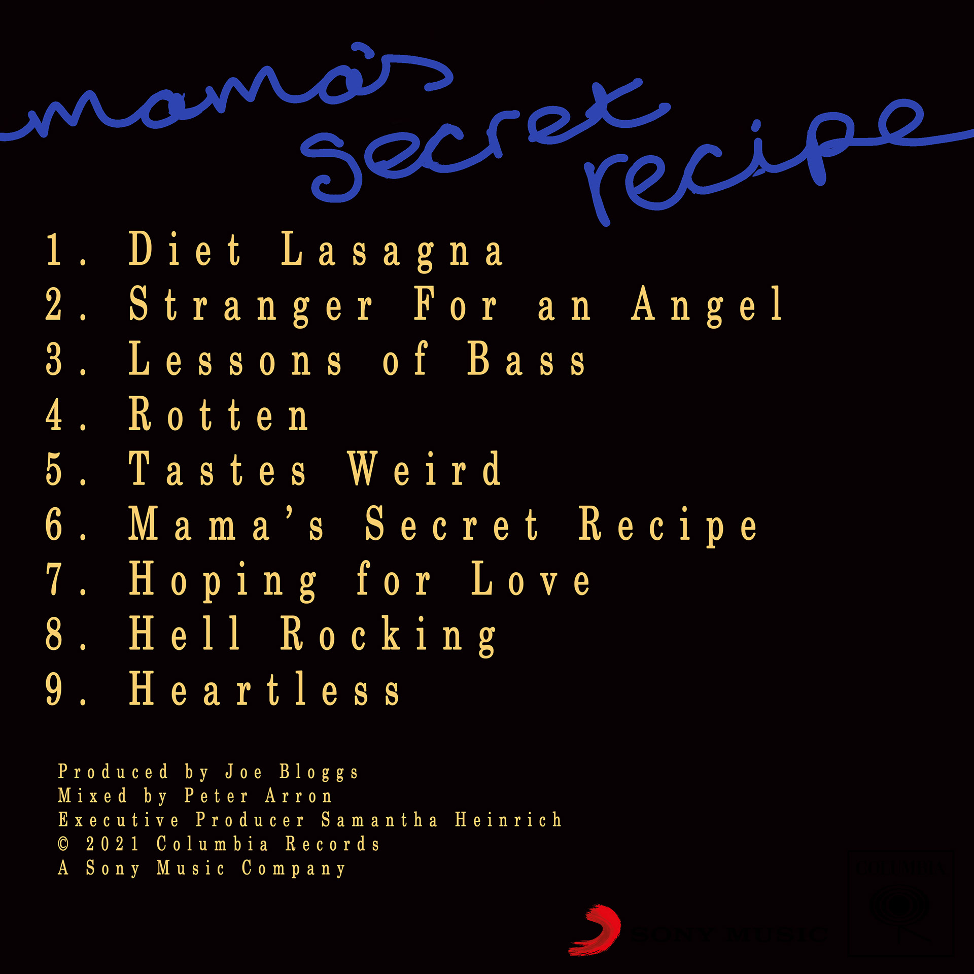
I then set to work on the back cover. I used three different song title generators I found online to help me create the track list. I added the album title to the back cover andI decided to use the same font as the band’s name on the cover for the song titles. I also used the same background colour. I selected the same yellow as used in the middle ‘Diet Lasagna’ on the cover to help further link the back and front cover. I added this to the back cover of my album with fake names of producers and mixers, as well as the Columbia Records and Sony Music logos as copyright. After some additional tweaking, and double checking all spelling errors, I decided that they were complete.
Cover 2: Abstract
DESC